 (Image via
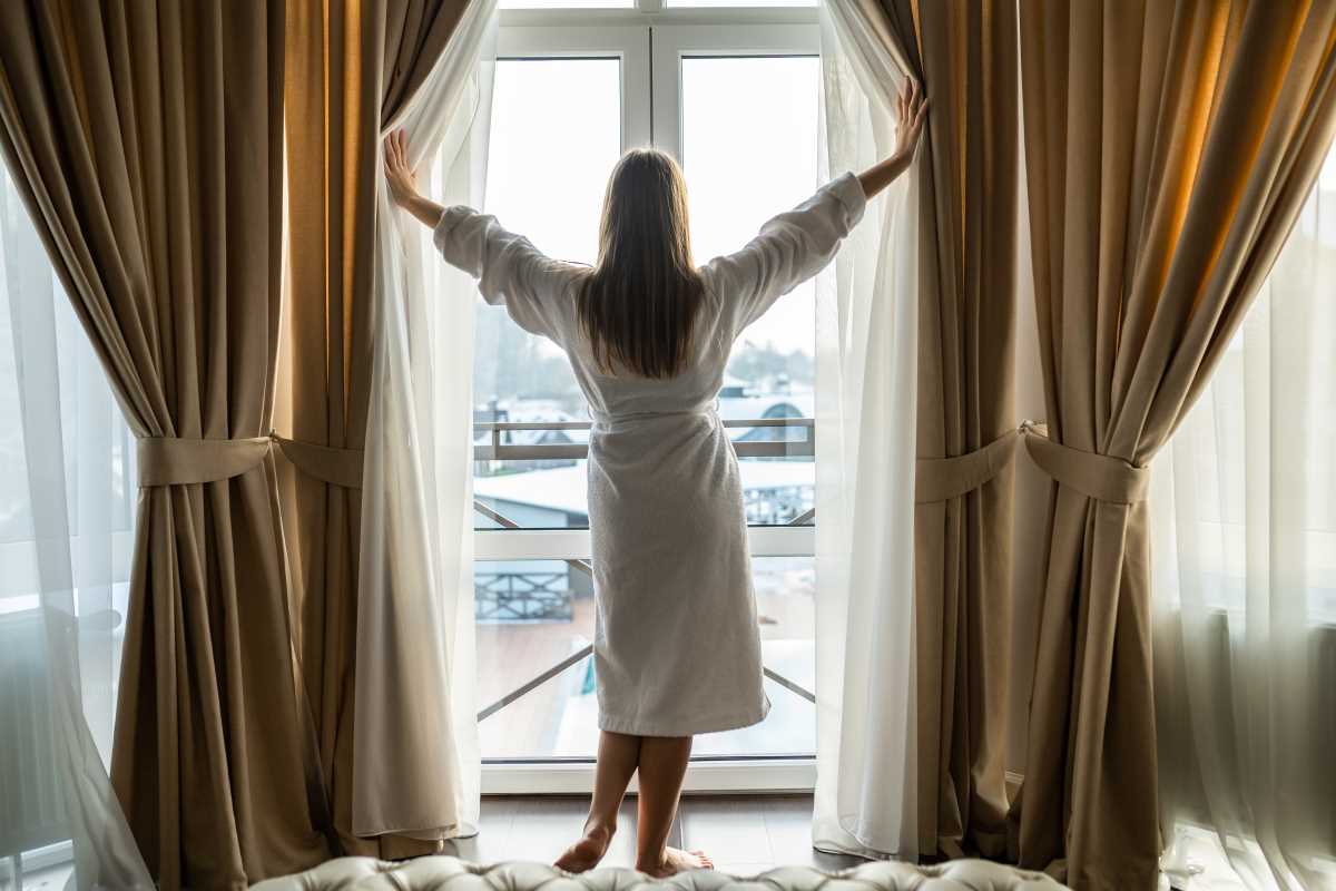
Open-concept living is breathtaking, offering expansive views, abundant natural light, and a sense of freedom that traditional floor plans often lack. However, designing for these airy spaces comes with a unique challenge: how do you define different areas without putting up walls? The answer lies in the skillful application of color. Coordinating color palettes across an open-concept interior is about more than picking a pretty shade of paint. It’s about creating a visual language that guides the eye from the kitchen to the dining area and into the living room seamlessly. By establishing a cohesive flow, you transform a cavernous space into a harmonious home where every zone feels distinct yet connected. It requires a thoughtful blend of strategy and creativity to ensure your home feels unified rather than disjointed or overwhelming.
Establishing a Neutral Foundation
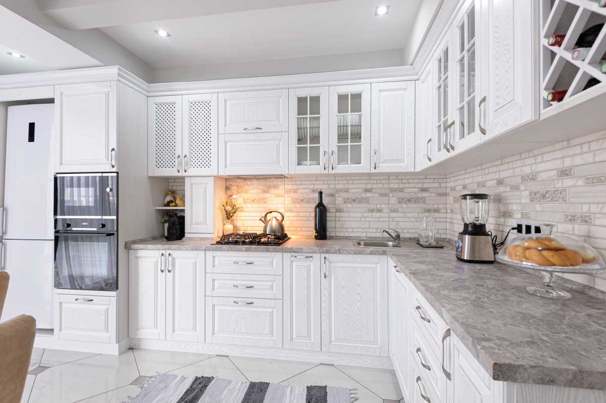
The secret to mastering color in an open floor plan often starts with a sophisticated, neutral base. Think of your walls as the canvas upon which the rest of your design story will unfold. A consistent neutral color running through the main connecting walls acts as a unifier, instantly making the disparate zones feel like part of a singular vision. This doesn't mean you are limited to stark white or boring beige. Today's neutrals range from warm greige and soft taupe to cool mist and rich charcoal.
Using a single background color allows your furniture, art, and accessories to take center stage without fighting for attention against a chaotic backdrop. It provides breathing room for the eye, which is essential in large spaces where there is a lot to look at.
- Warm vs. Cool Undertones: Decide early on if you want a warm atmosphere (yellow, red, or orange undertones) or a cool one (blue, green, or purple undertones) and stick to it for your base.
- Consistency in Trim: Painting all trim, baseboards, and molding the same shade of white creates a clean, architectural frame that ties the entire open space together.
- Flooring Continuity: Consistent flooring acts as a "fifth wall." Running the same hardwood or tile throughout reinforces the flow established by your neutral walls.
The Rule of 60-30-10
Designers often rely on the 60-30-10 rule to ensure balance, and it is particularly effective in open-concept homes. This formula helps you distribute color in a way that feels intentional and pleasing to the eye. In this setup, 60% of the room is your dominant color (usually the neutral wall color), 30% is the secondary color (upholstery, curtains, rugs), and 10% is your accent color (throw pillows, art, vases).
In an open layout, you can twist this rule to create subtle distinctions between zones while maintaining harmony. You might keep the 60% neutral base consistent but swap the 30% and 10% colors between the living room and dining area.
- Inversion: If your living room features a navy sofa (30%) and gold accents (10%), try using gold dining chairs (30%) and navy placemats (10%) in the adjacent dining space.
- Shared Threads: Ensure that at least one color from your palette appears in every zone. A throw blanket in the family room might match the backsplash in the kitchen.
- Gradual Shifts: Instead of abrupt changes, let colors evolve. A deep forest green in the kitchen could lighten to a soft sage in the breakfast nook.
Creating Transitions and Zones with Accent Colors
Unity is key, but you don't want your home to look monotonous. Accent colors are your best tool for defining specific functional zones within the larger space. These pops of color act as visual anchors, signaling where one "room" ends and another begins without the need for physical barriers.
The trick is to choose a family of accent colors that play well together. If you love jewel tones, you might anchor the living area with a sapphire rug and the dining area with emerald curtains. Because both colors share the same intensity and richness, they coexist beautifully.
- Rugs as Boundaries: Area rugs are powerful zoning tools. A vibrant rug can effectively "wall off" a seating area, grounding the furniture and introducing a specific color story for that zone.
- Statement Walls: While painting every wall a different color is chaotic, a strategic accent wall behind a focal point—like a fireplace or a headboard—can add depth and drama.
- Art as Inspiration: A large piece of art can serve as the palette generator for a specific zone. Pull colors from the canvas for pillows and accessories to create a contained vignette.
Balancing Bold and Subtle Tones
Navigating the spectrum between bold statements and subtle elegance is important for maintaining flow. Too many bold colors competing for attention will make the space feel cluttered and smaller than it actually is. Conversely, a lack of contrast can leave the interior feeling flat and uninspired.
The goal is rhythm. You want the eye to travel across the room, landing on interesting focal points before moving on. High-contrast pairings draw attention, and low-contrast pairings allow the eye to rest.
- Visual Weight: darker, bolder colors carry more visual weight. Use them lower to the ground (rugs, sofas) to ground the space, or sparingly at eye level to draw focus.
- Repetition: Repeat a bold color at least three times across the open space in varying sizes (a large chair, a small vase, a pattern in a pillow) to make its presence feel intentional.
- Texture Over Color: In areas where you want calmness, skip the bold color and use texture instead. A chunky knit throw or a leather ottoman adds interest without visual noise.
The Impact of Lighting on Color Perception
One of the most overlooked aspects of choosing a color palette is lighting. In an open-concept home, light changes dramatically from one end of the space to the other. The kitchen might be flooded with cool morning light, as the living room basks in the warm glow of the afternoon sun. A paint color that looks fresh and modern in one corner might appear muddy or dull in another.
Artificial lighting also plays a massive role. The cool, bright LEDs often used in kitchens for task lighting will render colors differently than the soft, warm ambient lighting of a dining chandelier.
- Test Patches: Never rely on paint chips. Paint large sample patches on different walls in every zone and observe them throughout the day.
- Consider Light Temperature: Ensure your light bulbs have consistent color temperatures (measured in Kelvin) where possible, or choose paint colors that can handle the variation.
- Reflective Surfaces: Remember that light bounces. A bright red wall in the dining room might cast a pink glow onto your white kitchen cabinets.